


 Music
Music
Exploring the future of music publications
by Knar Bedian
January 2, 2014
In 2012, SPIN magazine got a facelift. This year, both NME and Billboard’s print editions followed suit and saw redesigns, too. Seems like the music world’s publications are working to clean up their acts, and, there’s reason for it: a healthy dose of good design goes a long way. Jacek Utko, a Polish magazine designer, had a whole Ted talk on how his redesigns caused huge increases in circulation. That’s great news for the print media in the music industry.
But to simply celebrate this finding would be foolish, since it’s the digital front where most readers interact with the content. Ironically, what these publications offer on the super-fast web is a virtual experience that hasn’t quite caught up with the times—most have simply transported the contents of the physical medium, only making small changes to fit its digital shoes. (Although in SPIN’s case, the move was permanent, as its print publication ceased and it made its new home online-only.) What results is a lot of lost potential in utilizing the capabilities of the online medium. Just think, the move away from print mean little things like actually hearing the songs discussed in articles thanks to streaming capabilities. Easy enough, but it’s not exactly happening—even NME’s album reviews have left our ears aching for sound, as their web posts are left bare and audioless.
The Move to Digital
Of course, not all music journalism has ended up this way—those who were born ones and zeroes seem ready to take advantage of what the digital medium has to offer. By mid 2012, Pitchfork’s elegant Cover Stories had graced our screens, transforming the interview into an interactive experience. This year, they launched a weekly app, Myspace’s new look (below) has helped it step up.
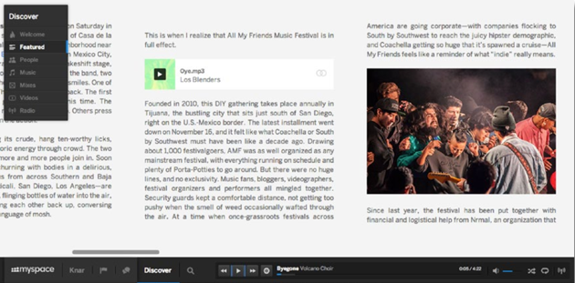
Myspace’s built-in music player also incorporates the social media aspect within the same widget.
That’s just what’s going on with the Pitchfork Weekly app. The amount of posts on the site can be overwhelming, so the app was developed as a way to highlight key stories. Yet it still falls short in a number of ways. While the front page is flashy, with a graphics-only approach (the text appears when you swipe), the articles themselves have still fallen somewhat flat. Sure, they finally tackled an issue many have with app magazines (this one included)—the lack of shareability—with a Facebook and Twitter icon tacked to the bottom of each article, and accompanying music is sometimes present. But the interactive ability of the app medium is a bit overlooked. It pales in comparison to their web Cover Series, which garnered an immense amount of praise, and rightfully so.
Swimming Upstream
Sure, Myspace may not be a publication, but it was losing just as much steam, and its big makeover really paid off. The takeaway is their aesthetics. We’re in the age of tweets and infographics; we want our information to be easy to consume. They’ve taken information and transformed it into something you actually want to read. The Discover section reveals posts in an image-heavy display, similar to that of the new Pitchfork app. But the articles themselves offer so much more. Not only is there playable music content within the post, but social media is built straight into the player, allowing Myspace users to connect with artists without leaving the page. It might not seem like a big deal, but these days every click counts.
SPIN’s app does take user interactivity into account. Not only does it maximize the built-in video and music player features, it allows for curation: any song you fancy can be favourited and collected for later listening.
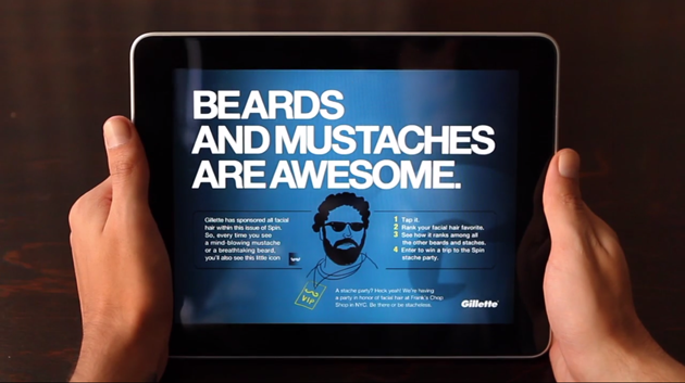
Spin’s app is fully interactive—even the ads.
It also interacts with user movements, incorporating the tilt movement in some pieces. Even the ads are interactive—in a campaign to sell razors, Gillette allowed readers to rate the facial hair of any artist in the magazine, as displayed above. Though it also blurs the line between content and advertising, it highlights the immersive feature the medium is capable of. Furthermore, the app can appeal to users of all kinds—those who just want the recommendations of a trusted cultural voice can listen to the playlist of all the works of the artists discussed in the issue. Playlists are to music magazines as tweeted articles are to a newspaper—a short form version of the content.
The Future
Creating interactive digital experiences from scratch is feasible for larger publications and companies, but it could potentially leave those with smaller budgets in the dust. But affordable third-party applications for building digital-friendly experiences have already cropped up; Readymag and Origami Design have taken the publishing process into their own hands, creating platforms to allow the average citizen to create their own digital publication. That means having built-in music players that bring songs from SoundCloud and a whole crop of interactive features that allow for greater user immersion.
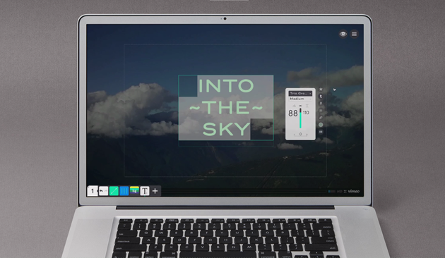
Readymag is an app built to simplify digital publication.
Music publications need to look forward and realize the rise of the app industry is a sign readers want their entertainment packaged in a more immersive, easy-to-consume manner. Compacting the information, adding captivating visuals, and upholding the interaction creates the experience Web 2.0 users have come to expect.

This article originally appeared in the December 2013 Issue of AUX Magazine.
Download and subscribe for free in the app store.
Tags: Music, News, AUX Magazine December 2013, MySpace